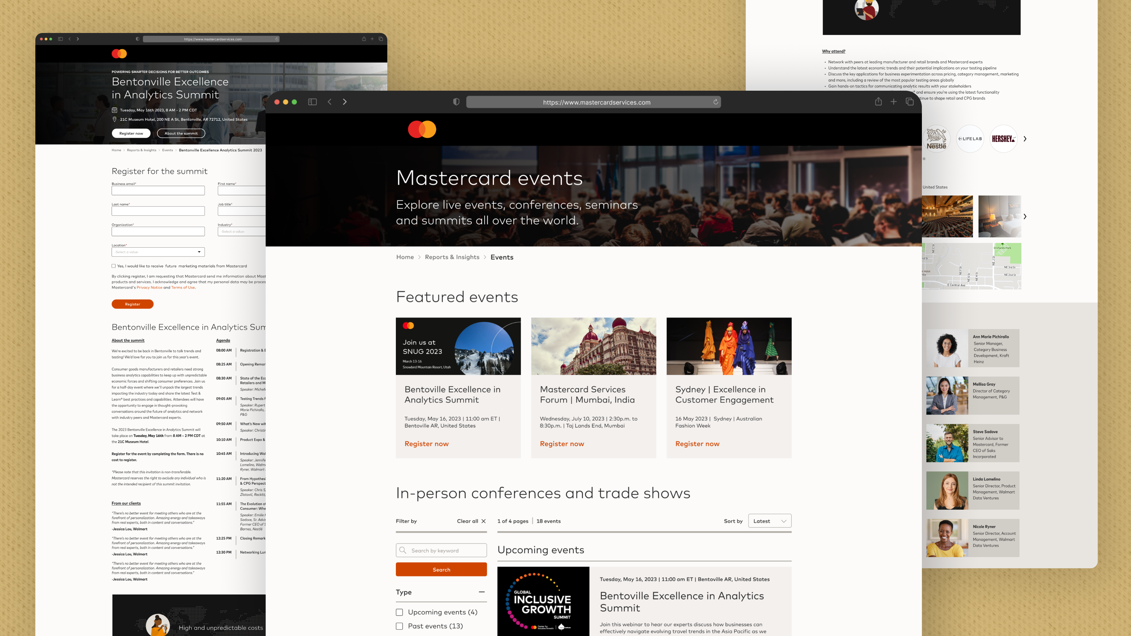
Redesigning events webpage
Giving the events’ web pages a more modern look.

Giving the events’ web pages a more modern look.

In 2023, the Events team observed product gaps on the Mastercard events listing and landing page. They then conducted a heatmap study and user surveys that could explain low conversion rates and user attrition rates.
Note: I have omitted sensitive information from this case study to maintain confidentiality.
I led the design of events’ webpages for desktop, tablet, and mobile environments to address business and customer needs and pain points.
I worked closely with the Events team, guided by my design manager. We analyzed user research insights and our approach to resolving issues, testing, and iterating.
For Mastercard, events are one of the many crucial touchpoints with customers and consumers where we can showcase our range of products and solutions. Therefore, it is vital that the events' web pages are user-friendly and attract consumers to attend the said events.
Our challenge was to address user behaviors and motivations while aligning them with business needs.
Mastercard hosts and attends several events globally each year, so the event pages must cater to a broader audience with varying interests and requirements.
Before approaching the design team, the events team conducted user research to identify critical issues with the existing events listing and landing page to enhance user experience. These are the insights that defined the redesign of these web pages:

The biggest goal of this redesign was to minimize the users’ cognitive load. This meant focusing on crucial information, structuring each web page similarly, removing distractions, giving users more control, etc.
Based on our team discussion and consumer insights, I documented the design goals framework that ensured all the stakeholders were aligned and prevented any digression.
The design process started with wireframing concepts, discussing them with my manager, and sharing high-fidelity versions with our product partners. Since I already had the brand guidelines that dictated the overall design, I could easily translate low-fidelity to high-fidelity design.
Testing high-fidelity designs that closely matched existing designs proved the most effective way to collect feedback. Users and business partners could compare the two and share unambiguous feedback.
With each iteration, the design became closer to what we had envisioned at the beginning of this project. Changes like separating the webinar listing page from the in-person events listing page, using tags to differentiate a live webinar from an on-demand webinar, introducing an event agenda, prioritizing the registration form, etc., positively impacted our users and their pain points.
One week before the design handoff date, the events team asked to add features like an introduction video, partner brands, venue images, and venue location on a map. These additions delayed the delivery date by two weeks since we had to implement these design elements and test them with product partners and users.
The development launched these updated webpages in phases to observe them closely and avoid any mistakes since it was a publicly visible website visited by users across the globe. However, two months into updating the events website design, company leadership announced a complete redesign of all Mastercard websites and branding to make them more contemporary and aligned with our logo.
This announcement was news to the events team, the design team, and the development team. Due to the announcement, the events team decided to stop any new changes to the events’ pages, and the design team pivoted their focus towards the new branding.